First: I finally learned what the heck people say when they want a storyboard of a museum gallery...or, at least, I saw an example. Asking anyone to make something based on the name of the thing you want--which has several different connotations depending on context--is perhaps a little unfair. Or, at least, unhelpful, since they don't know what you want.
The purpose isn't the same as for a movie or comic book storyboard, where most shots are basically set in stone by virtue of being drawn. A 3D space doesn't work like a movie, so that makes sense. However, this was the only context in which I had heard the term:
 |
| Storyboard from Spiderman 2 |
Problem? Problem.
What I saw at the Space and Rocket center was much easier, and the kind of thing I could probably finish today if I didn't have to write this up, write some other stuff up, attend two meetings, and give a presentation on poster design to some Duke TIP kids... Basically, it was a map of where in the room things are likely to be, similar to this one I made last week:

Followed by each exhibit in the sequence it's likely to be visited. Each exhibit would have a powerpoint slide--in the one I saw at USSRC, and he did acknowledge that some people prefer Word or whatever--with a list of artefacts that would be a part of the exhibit, graphics required, interactive experiences, that kind of thing.
At the end would be some samples of the design aesthetic the exhibit designer suggested with a handful of sample colour schemes, stuff like this:
 |
| Busy Office Scheme |
There's a website called Colourlovers.com they tipped me off to, which has a bunch of searchable colour schemes.
 |
| Apollo 11 Stamp Scheme |
The design aesthetic examples would, in fact, be SketchUp models, maybe with a slightly nicer rendering program to dress them up. There are some manufacturers whose products play really nicely with SketchUp, and they have a good relationship with the Space and Rocket Centre. If they were inspired by something really off-the-wall, that inspiration might also be included so that the designer doesn't look totally insane.
The handful of colour schemes is so that the upper ranking people can make some design choices and hopefully leave everything else alone. He didn't say that exactly...but that was the general idea.
Second: Some practical tips.
Most of what we talked about, actually, once I realised that we're basically on the same page as far as design intentions: Tell a story, with a timeline of some kind since those are easy to understand.
Basically, if you're going to have multiple "areas" within the same room (a requirement given PARI's space limitations, at least for now), it's good to apply separate-but-related colour schemes to each of those areas. An example was their exhibit with stuff from a now-defunct children's museum. They had an area more about forces in motion--the Newton's Laws, that kind of thing--and How Light Does. The forces in motion was more blues and greens, the How Light Does was more red and orange.
 |
| From Huntsville.org, because I forgot to take a picture. Oops. |
They also had a way to minimise the noise from a bunch of children running around, playing with stuff, screaming for no reason, and generally causing a riot: Put up walls. But not physical needed-a-construction-team walls! To save on weight, storage, and to increase durability, they printed their graphics on what was essentially Spandex fabric and mounted it on a frame they just had laying around. They can then put those up like a screen whenever they need some more sound absorption or just as decoration--the room was unique in that it had basically zero wall space. Actually, not basically: No wall space. The room was created by a sunken floor and some railings around the edge, with a ceiling high enough for a Skylab Solar Panel.
That's a design challenge we sure didn't have...
We had an advantage in one other area as well. Remember our raised floors?
There's an exhibit on space jewellery called Celestial Dreams. It features space-themed jewellery designs from a local artist, most of them on loan from her or design recipients, and the whole thing is very atmospheric. There's soft music, fancy lighting, little glass cases with delicate objects on custom designed stands (the guy who made them mostly does conservation)...

And do you see any wires?
Of course not.
They have a raised floor.
Not like our raised floor, though--our raised floor is robust metal and concrete, built to withstand and atom bomb (more or less). Theirs was constructed for this exhibit, on a budget since they're a NASA museum not a NASA datacenter. It's wood, mostly, and I don't think they have modular tiles. (Which, in fairness, makes for a more comfortable experience--our floor makes all kind of alarming noises.) He explained the principle of the raised floor to me, and I think I started grinning like a lunatic when I got to say that that was the one thing we do have.
Muahaha.
Third: I'm not completely bonkers here.
Telling a story through a timeline is an easy way to do things. Easy and effective. I hadn't quite made the connection, which is mildly embarrassing, but the Saturn V hall is a giant continuous timeline.
 |
| Arrows added to official map by moi. |
It starts in 1940 and progresses down the length of the rocket to the moon landings (through the development of the Saturn V), around to talking about the lunar surface, return from the moon, Skylab, and the future of rockets. The last is a little slapdash-added, and they know that, because it's changed substantially since the last time I was there.
So a timeline, even one that's only obvious in places, is a good way to tell a story this (literally) big. We'll have a more cramped and less comprehensive time of it, at present--you could fit multiple space galleries in the width of the building, I'll say that--but I'm not barking up a completely lunatic tree.
 |
| The most obvious part of the timeline, where years are carefully labeled |
Many of the exhibits also employ graphics in a similar--if not greater--proportion to artefacts. They sink display cases into the walls or pop them out as needed, letting random stuff go largely unnoticed compared to the stuff that tells the story best. Photographs play a huge role, though, since some things are too large to be displayed, too rare to be displayed, or were illustrative of a specific mood they wanted to evoke.
In other words, you can totally make an exhibit with like four artefacts and some pretty pictures.
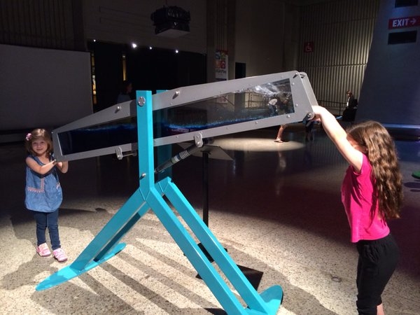
I saw similar at the Oconoluftee visitor centre. If it rotates and that's it, it can't break. Kids like to spin things. Win-win. More complex interactives, or digital interactives, are great--an android tablet, with all of the buttons covered by its display, is a fairly sturdy digital interactive device on its own. (Hide what it is, basically). A broken laptop (only the screen is still alive) with a picture piped to the broken screen externally is a good way to have a laptop for aesthetic reasons with a minimum of things that could go wrong. Pry off a key? Eh, who cares, the keyboard hadn't worked since 2011 anyways.
Fourth: Robust is good.
Meaning, make everything damn impossible to destroy. If you aren't completely enclosing the edges of a graphic, have the manufacturer wrap them around the edges of whatever you're mounting them on. Make it so there's no way in hell that graphic could be peeled up by destructive kidlings. When it comes to interactives, simple is good. They had some gyroscopes you could play with the last time I was there, over the winter break; every single one was broken. By comparison, the instrument panel interactive--basically a rotating drum--still looked great. Because it had one moving part and what would somebody even do to break it? Smash it with a sledgehammer? There's not much short of that which could go horribly wrong.
 |
| It rotates. Period. |
You get the idea. (Daniel started laughing when I mentioned this, because if there's one thing we've got, it's badly broken computers.)
Fifth: Resources
I need to email the guy I talked with about some of these, as a follow-up. Basically, he had some tips for specific products that are good for the aesthetic that the USSRC has been trying to build--it's subtle, but they're actually undergoing a very quiet redesign in their own right--and some information about how they're used and how I can use them in my designs. For example, in addition to colourlovers.com , he tipped me off to this thing called Octanorm. Their website is...um...special, but the concept is a modular railing that can be assembled into sign mounts, barriers, display cases, railings, basically anything that's part of an exhibit gallery. It also plays really nice with SketchUp.
Oh, SketchUp...
I don't know if there's an industry standard for modelling software, or even a handful of industry standards like in Aerospace Engineering. There probably isn't, because 3D modelling is fairly new. Either way, the design department at the Space and Rocket center had a similar approach to yours truly, albeit with bigger computers, more precise measurements, and probably at least twice as much RAM. (I have 4 gigs. It struggles sometimes.) They made a model of their galleries and put stuff in to see how proposed designs look. They have their own names for them (which I can but guess as to which room he meant by "The Atrium") and like the flythrough capabilities.
So my use of SketchUp to model the whole gallery is actually totally sane and I have, by accident, stumbled upon a design practice of a real museum designer. Woo!
As for a different sort of resource, it's possible that PARI could loan items to/from the USSRC. For example, he mentioned that they have in their collection some Saturn V antennae, which aren't on display. You know, the sort that Rosman could have communicated with. Those. And it's possible that if our people talk to their people, they could loan stuff like that to us--because, for whatever reason, we don't work with them! Even though we are literally the closest dedicated space science centre to them that isn't, like, Marshall Space Flight Centre.
Gives me the warm fuzzies to think I might have started something, it does. Almost like I'm a real museum person! Although I also sort of dread that it'll make me a real museum person... Perhaps it should be a comfort to know that the guy I spoke with said he'd been in the field for 15 years, his current job (vice president of exhibit design) for something like four years, and he only has his undergrad degree in, of all things, theatre.
And I wouldn't have understood him without years of space camp, when it came to a fair number of the things on/off display. I have a pretty good jargon vocabulary at this point, although it isn't the sort of thing you learn in school. For that matter, this whole field isn't really taught in school.
Dramatic sigh...
No comments:
Post a Comment