30 July 2016

Wrapping Things Up

So I finished up Thursday morning, I gave my presentation to the staff and was out by lunch. I think it went well, I think I was able to inspire some people, and I think I got the ball rolling. They started throwing some things around I hadn't considered--I mean, I'm one person, hello--and seemed pretty impressed by the amount of work I was able to do on a task that's literally impossible for one 20 year old with no experience to complete in two months. Which is nice.

USB with presentation, 3D printed model of timeline kiosk, colour scheme options

As we left the room, my boss told me to bug him for a letter to add to my resumé--which I'll do, definitely--and wanted to know if I might be interested in working with the project team he wants to continue what I've started this summer. Since I'll be at UNCA, I'll be as close as several staffers who actually work there full time. Maybe I can make a part-time job of this (since I will need to actually attend class). Certainly I can stay involved, and there's a real chance they don't want to have to train anyone else; by now, I know more about exhibit design than anyone else on staff. Possibly including my boss, who was in museum management. They do hire past interns, sometimes, if the interns are dedicated and able to do something that the normal staff can't or don't have time to do.

They've said that interns are pretty much welcome to stay a night, so long as you clear it with everyone ahead of time. Would I want to? Well, probably not, I'll have a dorm room to myself an hour away and building 27 smells a bit. But it's nice to know. I'll certainly bring people to evening at PARI--heck, I'll help out with evening at PARI.

They're also starting the process of working with the USSRC. They emailed the guy I spoke with, and hopefully can actually develop a more relevant collection than half a room full of nothing but space shuttle stuff.

I've done something that will at least start to create a lasting change. I began the process of learning a useful trade--is exhibit design a trade? or useful? Meh. I began to learn how to do it, anyway, and there is a demand for it. I also made some useful contacts, since...I wouldn't mind doing this for a living. I would prefer to do it not all by myself, but most if not all museums seem to have more than one person working on design. I also learned how to use SketchUp and the basics of design briefs--although I have a feeling that the specific format changes based on situations.

All in all? Good summer. Now I want to sleep and not even think about sketchup/3D modelling/design briefs for a few weeks.


26 July 2016

No more maps!

A short post, because I'm basically just working on my powerpoint for Thursday...


This is our museum right now.

Thrilling.
This is what happens when I include all three rooms--that last room only gets storyboarded and a design brief, because I don't have time to give it a real design.

And with that, I think I'm done making iterations of this map.

Hallelujah. 

Steve won't like that I've lumped his idea of control consoles for Smiley and the 12m together into citizen science, but frankly, I worry about making those controls open access to anyone. Because there are problems you can get into with both of those scopes that would damage them and the point of this redesign was a museum experience that doesn't require facilitation! Would it be cool? Yes. Would it be worth damaging the telescopes? No! But we can have computers set up there, with something like Radio Galaxy Zoo, maybe, in case we do want to have somebody standing by to facilitate Smiley or the 12m.

Just something to address while presenting, yeah?

Colleen's work here is done, and Moustache Ben had something come up. So we're now down to three interns.

25 July 2016

Scientific paper? But I didn't do any science!

The display cases were donated from the Dead Sea Scrolls exhibit and were custom made for those purposes.

Hence the weird dimensions.

Although I still question the need to make some of the dimensions quite so utterly bizarre.

At any rate, they're starting to bug us about our end-of-internship papers. Well... about that.

They apparently haven't had any interns tasked with jobs quite like this one before--obviously. If they had, my work wouldn't have been quite so...from scratch. It would've been more like, "Last year's intern suggested this interactive for the museum, develop an interactive for us." Which, while still a pretty intimidating task, would probably have been a little less "Ack!" than "So we'd like you to learn how to design museums. Then design us a museum."

So...

I guess I'll be giving them All The Stuff A Real Designer Would and we'll call that good enough. Because a paper about how I learned how to museum is less helpful than a paper about how you're going to at least start fixing the problem of your disorganised jumble of museum kthxbye.


22 July 2016

Home Stretch

Star Trek: Beyond was excellent. Go see it. We saw it *technically* a day early--it comes out today, officially--because of how the Brevard Co-ed Theatre works. They only have one screen and they cycle films through fast because it's the only theatre in Transylvania County (and will probably stay that way for the foreseeable future), and they don't do midnight premieres. They do 7pm premieres. Although, technically, they also do 3pm showings and 11am showings, so I assume the actual premiere was at 11am... Anywho. All the staff wore Star Trek shirts, I didn't even know the film was coming out this summer (...I don't actually know how I missed it...) so I got a lovely surprise, the new character was awesome, and the weapon used to defeat the alien (you knew that was going to be the plot, so this definitely doesn't count as a spoiler, it's Star Trek) was completely unexpected and thoroughly awesome.

If you're not into Star Trek, assume they used the magic of friendship. (They totally didn't.) Also enjoy the fact that as we waited to get tickets, an older gentleman cycled past in a propeller hat, ringing his bicycle bell. I love Brevard sometimes...


Today, among other things, I'm making an outline of my final presentation-to-the-staff. (Note to self: Talk to Steve about how he wants me to give them the digital files I've been working on. Nebula? Pachyderm? Burn them to a disc? USB? Floppy disc? The last might be challenging, since I can't use floppies on my computer and the file is WAY too large...) 

So far I have this order:

  1. Start with successful museum examples and discussion of how museums in general have good practises, certain features, the basics of How Museums Do.
  2. Describe the PARI galleries and how we could  do that, but don't. 
  3. Segue into talking about PARI's collection and resources, tapped and untapped. 
  4. Use that to move into the storyboard, starting with the map and list of exhibits.
  5. Include things that would be nice to include, that we have the materials and/or history to include but can't due to space limitations. Don't make that pun. A small space science centre is cruel to comedy. 
  6. After a more standard storyboard, give a virtual tour of what I got. That's going to be a little bit messy--sketchup does virtual tours okay...ish. But if they want better looks at any particular areas, I may or may not be able to give it to them. I'll try. It's a little unwieldy. Maybe I can put together a video? I'll have to explore this next week.
And I also spoke to Thurburn about what he'd like to see in an exhibit about our plate archive, since he's essentially the PARI god of glass plates. We came up with the bare bones for me to design something around--it won't be as complete as the others, I guess, although that's going to bother the stew out of me so I'll have to mull it over. 

We would like to include essentially two parts: 

A small part somewhere prominent, explaining what APDA *is* and where it came from, where the telescope images came from (thin air? hardly!) and how we ended up with them. Essentially a history section.

And a science section, which will explain how the plates are used
  • to see stars over time
  • stellar distances
  • spectra and stellar classifications (among other things)
We can intersperse that with stuff that will basically teach the very bare bones of astronomy 101--how parallax works for measuring stellar distances, that kind of thing. 

Thurburn is rightly concerned about including original plates in the exhibit, since people are weird and scientists, being people, might want that random plate you chose to display. I propose we take advantage of the fact that we have an extremely high resolution scanner (1 pixel=nanometer scale) and make enlarged versions on something more durable than glass--like, say, that plastic laminate stuff they have in museums. You know, the stuff that's frequently used for hands on exhibits. Then we have something that looks good, is damage resistant, and the original plates lead happy lives in building 4 with the other plates. 

We could also potentially take advantage of the fact that Daniel spent his summer teaching the computers how to take the high res scans, pick out the stars in them, and then potentially turn them into an animated GIF. So we could create something like this, over a scale of years, using the plates to look at some interesting astronomical object--an expanding nebula or similar:

Except, well, not in color 'cause we only have black and white photos


Stick it in one of those digital photo frames maybe? Not sure. But I'll throw it in the design brief for that room, since I'll be able to accomplish a design brief if not the actual design. 

(Probably. Some of the other design briefs that already have happy, healthy designs might have to be temporarily moved to the back burner.) 

We have a citizen science project that uses APDA data to get people to classify stars. It isn't terribly user friendly, and they want to update it--it's called SCOPE, you can google PARI SCOPE (yes, that was intentional--I hope!) if you want to get involved. I won't direct you to it, since it is a pain in the ass and I don't think we actually use the data.

That being said, if they want to update it, they could probably use Zooniverse to create a more user friendly experience; it has some free (I think) project builder tools. I would like to get involved with that, but I don't have the time or expertise; maybe it would be good for volunteers. Or future interns. Or if people just have time... either way, it looks good, will readily support up to 10k visitors, and is free to use. But it would take time to set up--like...a lot of time. 

I'll run it past Steve. Chances are, if they want to redo SCOPE anyways, they'd be happy enough to find some website that will readily support at least part of the operation, without anyone having to code it. They'll have enough of a nasty time coming up with code to automatically isolate spectra.

Wait, what? 

Well.

SCOPE shows people black and white stellar spectra. Like this: 


It then asks people to classify stars based on those spectra. Sound hard? Sound wooly? Yes. I've messed around with a bunch of crowd sourced science projects, and it's one of the least user friendly I've had a chance to work with. 

It would be a difficult task to arrange that process in such a way that a twelve-year-old could understand it. Doable? Eh, probably. I wouldn't be surprised to see it on an internship thing next year--especially if I tell them it would be a good one. You would probably need somebody with a solid knowledge of at least one programming language (not that I'd know which, since I can't actually speak any of them) and solid public communications skills.

But I digress. I don't have time to pursue a whole new project. I need to finish this one, to the best of my ability. I'll include it in my recommendations, sure, but I'm a designer (well, a physics major who hasn't even taken Design 101) not a programmer! (I'm really not a programmer. But I'll leave a bug in their ear as part of my presentation next Thursday, so they can hunt down one for next summer.) 

Oh yeah! I'm presenting. Probably next Thursday. What will I do Friday? Hell if I know! Hang out? Hike? Explore the delightful town of Brevard? I doubt it'll be a problem. 


21 July 2016

Colour Fun?

Look! Colourful Display Cases!
All of the display cases you can see with coloured bases are actual display cases we have. They're labeled, but the labels are only properly visible from some angles. I did what I could. The ATS-6 model is fairly obvious. The yellow frame isn't precisely accurate, but it's good enough to get the point across and look mildly interesting.

I'm now trying to model something more like what I was envisioning for the timeline displays. I have the model...but what about the colour scheme? 

Temporary scheme to show detail
I'm not crazy about this set of colours, in particular. It's meant to look a bit retro, taking inspiration from Atomic Era radios and a picture--presumably from the 1960s--showing the "office of the future." Where everything was vaguely coral coloured with organic white plastic edges I don't think I can even model, let alone build....The grid thing is a speaker, the black a small computer screen, so it can show videos or whatever. Heck, you could stick an android tablet in there and make it a touch screen interactive, so long as you fit it in there in such a way as to conceal the charging cable and all the buttons. I'm envisioning this made out of some sort of particle board or similar.

I'll probably slap 'em like that in there and let Steve figure out colours. Because I doubt he cares, since he was willing to go along with my randomly chosen pastels. I know the scale works, since I did the whole thing on a base approximately the size of display case E (the smallest one) and next to a 2D scale person, I like the aesthetic, I *think* I'm out of things to model.

Which is good. Yes. Very, very good. 

(Did you notice how many rounded edges there are in that thing? I have conquered you, rounded edge tool. I won, though you put up a valiant fight.)

In Situ
So the Space Shuttle cases are coded blue and gold, the satellite case a teal and gold, the antennae dark and light blue, and the timeline are this brown and red, like in the consoles. 

I also updated the map to reflect this a little better, as well as look good with the color scheme I grabbed for my final storyboard:

Colours from an early 1970s Punch Card Advert

My colors for this are stolen quite shamelessly from this advertisement: 

Originally found here.

My reasoning being that they look tolerably close to the colours in the actual gallery model--I'll be suggesting this scheme, no mistake--distinctly "vintage" when you slap them all together, and they don't look wretched with the PARI logo, which I kind of have to include. Win-win. Also, it's easier to take a colour scheme from a photo than a 5-colour colour palette; it's not practical to have a whole room with only 5 colours. Or a powerpoint. Or a floor plan. Or...you get the idea. I've also generated a few test schemes from various photos of midcentury modern living rooms. 

I'm also working on individual design briefs for each exhibit, which is an exercise in tedium. Also in minor self disgust, since my natural inclination is definitely not to use all active verbs, pompous tone, and to sound like some kind of end-all authority on anything. However, I feel like I have to if I want anyone to actually take action and implement some of my (I feel quite reasonable) ideas. I'm only asking them to fabricate, like, two things: A display for the LEM and the timeline consoles. I can redesign the former if I really want a retro look, but as it stands, I have two functioning CAD models for each. One is even labelled, because I want people to take it seriously too.

You can still change the colours, but I'm satisfied with this.
So I'm writing stuff like:

Satellite Exhibit Design Brief

Introduction

It is essential to contextualise the ATS-6 satellite. The satellite is large and will, with proper treatment, serve as a centrepiece or focal point of the room. Guests will appreciate the hulking piece of equipment as part of PARI’s story. They will be provided with the resources to understand Rosman’s role in its development, the importance of the satellite to the history of space communications, and how it served as a precursor for modern communications satellites. 
The exhibit will be dominated by the ATS-6 but will also include the small models of the other three satellites, graphics showing satellite orbits, and possibly a video clip showing the history of the ATS-6. 
AKA: This is a display case, a satellite, and some nice signage. It'll use the TV screen that is already inexplicably on the wall in that spot and it'll show a video that is actually relevant to the site for a change. That you already have on your internal network somewhere. You don't even have to take a clip if you really want, although I'd suggest it, since it's a bit rich to ask anyone to stand around for 30 minutes.

It's also worth noting that I'm probably starting to approach the limits of my computer to render this model--it probably wants more RAM. I think I'll see about upgrading it before school starts, because I wouldn't be surprised if my experience with SketchUp results in my having to use this program again. It isn't such a bad thing, but my computer really is getting a little annoyed with me.

I did have a meeting today and Steve finally said what he wants me to design for that third room--which is currently empty except for a 100cm by 75cm sandbox. I shall continue my private grumblings about "it's not really that easy"... C'est la vie. He wants to expand our mini-interactive for APDA into a full scale exhibit about the plate repository, preferably involving our own citizen science project wherein we crowdsource stellar spectral classifications. (I think I actually suggested that in an email...whatever. Means I've already had it in the back of my mind.) He also liked my suggestions regarding colour scheme and so on. He wanted me to show Ben the Intern Coordinator (not Ben the Intern--it's confusing) what I've been up to and was complementary enough that I can't get too annoyed.

Which was probably the point. Ah well. I have gotten a ton faster with SketchUp, and it doesn't take prohibitively long to model things anymore. Also video games have given me some lovely shortcuts for making things look like better models than they actually are. Case in point: The ATS-6. It's a box with photos slapped on the appropriate sides and some minor detailing so it doesn't look totally flat.

Looks impressive. Is box with feet.
The angled yellow bits were surprisingly difficult/annoying, but since those are the only details in the whole freaking model, it's not that huge of a time sink. It's not like I'm modelling every detail of Mir or something.

PLEASE NOBODY TELL STEVE I SAID THAT HE'LL GET IDEAS!!


19 July 2016

Not that simple

My task for the day included creating 3D models of a display case that I could recolor according to areas in the museum.

Hoo boy.

That is not as easy as it bloody sounds.

Especially when you consider that our display cases are all different sizes. And the sizes make no sense.

Take the one that is 2' 9 3/4" square.

I tried measuring it in metric, but it's obviously supposed to be in english units because those are marginally neater. It isn't compensating for the edge bevel so the plexi was easier to cut--the edge bevel is .75". What maniac made this? It's 2'7.75" tall. Why?! why?! Did somebody have a really slapdash ruler? How do? And why aren't any of them identical? They don't look like something we could have made here, so they were obviously meant to be manufactured this way.

I...

I don't understand.

Display Case D--we have A-H. I'm only using letters because one was labeled E and another F.
I'm thinking of modeling all of them out of spite, since I spent all morning trying to get the plugin that lets me make rounded edges work. Also so I can be damn sure that nobody else at PARI can recreate these things without considerable headache. Again. Out of spite for SketchUp. 

18 July 2016

More Coherent Reflection

By "More Coherent", I mean "Extremely Long But With Pictures". Just a warning.

First: I finally learned what the heck people say when they want a storyboard of a museum gallery...or, at least, I saw an example. Asking anyone to make something based on the name of the thing you want--which has several different connotations depending on context--is perhaps a little unfair. Or, at least, unhelpful, since they don't know what you want.

The purpose isn't the same as for a movie or comic book storyboard, where most shots are basically set in stone by virtue of being drawn. A 3D space doesn't work like a movie, so that makes sense. However, this was the only context in which I had heard the term:

Storyboard from Spiderman 2
And I was concerned. Because that's hella complicated and a heck of a lot of drawing. I do not have practice drawing stuff that well, that fast, and I know from experience that a well-done inked comic-type-thing can take a week if you're working on other stuff...for like 8 panels.

Problem? Problem.

What I saw at the Space and Rocket center was much easier, and the kind of thing I could probably finish today if I didn't have to write this up, write some other stuff up, attend two meetings, and give a presentation on poster design to some Duke TIP kids... Basically, it was a map of where in the room things are likely to be, similar to this one I made last week: 


Followed by each exhibit in the sequence it's likely to be visited. Each exhibit would have a powerpoint slide--in the one I saw at USSRC, and he did acknowledge that some people prefer Word or whatever--with a list of artefacts that would be a part of the exhibit, graphics required, interactive experiences, that kind of thing. 

15 July 2016

Reflection on the Space and Rocket Center

If you're in on this pokemon craze--or Ingress--spend a day at the rocket center. You won't regret it.

Now that that's out of the way.

I finally learned what the heck Steve wanted when he said he wanted a storyboard, because the man I talked to showed me an example of one he made earlier this week. He also gave me some useful tips for placating The People In Charge--come up with several options for things like color schemes was an easy one.

He was amused to learn that we were the ones who got the ATS-6 satellite, because they wanted it too. We had a better claim; our facility developed and talked to the thing, whereas they wanted to use it to tell the story of Von Braun since he also developed it. They're going to have to fabricate a model. He also suggested having our curator reach out to them if we want to borrow anything from their archives. Since we're the closest space science center, it's ludicrous that we don't have some kind of relationship with their facility; I'm going to push the notion of forming one. Hard. 

We also discussed the importance of telling a story in exhibit galleries and how even subtle things like varying colour choices can make distinctions within a single room. Also, some tips for graphics: Have them wrapped on the edges unless the edges are effectively framed, or people tend to destroy things. I also took special note of something I've seen in quite a few museums: It's possible to compose a museum with relatively few artefacts (chosen to highlight important points) if the graphics are very well done, interesting, and informative. The timeline from 1950-1955 or so in the Davidson center is like that.

I was gratified to learn that SketchUp, while possibly not any kind of industry standard, is the modelling software of choice at the USSRC. So I'm learning the  a right software for this field, at any rate, not just shoehorning some software into an application its badly suited for.

I have a few more notes and some photos, but I'm tired. So I'll write something more coherent on Monday.

Yawn.

13 July 2016

Lightning and the Rock Gallery

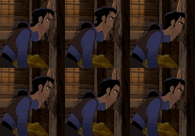
Something I should probably note: Sometimes my posts are kind of short, grouchy, or generally stressed. Or I feel like I said basically the same things I said the previous day. In those cases, I don't intend to share them to Facebook because I don't think anyone would be particularly interested in a post mostly dominated by gifs of that guy from El Dorado banging his head on the wall.

ICYMI, then, I need to home the 1/3? scale Lunar Module. I'm inclined to do so in place of a dinosaur, since the story of why the moon looks like Swiss Cheese is nearly as interesting as Falling Space Rock Killed All Teh Dinosaurs. We also have some stuff little kids might like in terms of interactivity, according to Christy, and a slew of 3D printed moon craters. A fake lunar landscape could also be a thing, if you're handy with papier maché, thus lofting our little lunar lander to a more visible height. (If they need a volunteer to make a fake moon, that sounds kind of fun, frankly. Paper mache and chicken wire, cover the whole thing with a thin slurry of plaster of paris, spray paint it dark gray, dry brush it in cheap white and light gray acrylic? It'd take me a few days, but I could totally do that. Stick the whole thing on a low table, exact size depending on the scale of the lander, surround it with a plexiglass barrier? Relatively professional looking with a minimum of cost, especially if we can find some old newspapers. Or possibly chicken wire. I wouldn't be surprised.)
Imagine, if you will, something like this. With different signage.
Do I need to model some kind of generic signpost? Um... maybe.
I did model the display the lander is sitting on.

We also have another satellite, but that ain't my problem because it's too big to fit in the room and everybody knows it. Something about giant solar panels and a satellite loosely the size of two minifridges taped together along their biggest faces. They're inclined to save it for now.

Phew.

El Dorado usually says it best.
Steve did want labels, so I'm slapping up these awful red and yellow signs. I don't think I'm going to bother making my own model, because these aren't actually going to be part of the gallery. That seems a wee bit much, and I don't actually know how to model stuff on angles. (That wasn't part of the tutorial series.) It gets the point across. Just imagine the gallery without the obnoxious signs...or, at the very least, with more informative signs that don't block walking paths and conform to ADA standards.
Because these could totally fit if we took out the most boring rocks (like the well samples... <_<)
It wouldn't take *that* much rearranging. Probably. 

Also I learned how to import custom textures, which is why the walls and carpet look a little different than in the first image. Want bright pink carpet? I can do that instead of gold. A nice dark wooden display? Oh yeah. That weird stucco wall texture, you know the one, from every dentist office ever? Done and done. (I'm getting pretty good at this program.)

I have also learned that my job could be weirder. Somebody--presumably as a hobby, hopefully as a hobby--3D scanned a rock.

Why? 

...a good question indeed. Ask us another. 

We have a meteor about this size. I'd like to raise it up to loosely waist level.
It's heavy, though, so it's going to take maybe two people to do that.
Possibly three.
Depends on the people.
Now, if you've visited PARI, you'll also know that we have a metric ton of rocks. 

I don't think I'm exaggerating by weight.

Most of them are dead boring and/or quartz. We have a representative sample of North Carolina rocks--which are mostly quartz. I like quartz, it's pretty, don't get me wrong! But, for crying out loud, it's dead boring to see a rock museum that's 45% amethyst and quartz. Nor am I interested in polished well samples...which we also have on display. Somebody was digging a well, dug up a pretty rock, polished it into a cabochen, and it's on display at PARI for some mystery reason. 

Why? 

I don't know. We don't need that much random rock crap on display when we can focus on the cool stuff--rubies, sapphires, garnets, emeralds, uraninite, and our other really shiny rocks--and devote the rest of the room to meteors and the lunar module. Hence this label for the remainder of the room:

"The Most Interesting Rocks"
Perhaps it's a little passive aggressive. I'll downplay it when I show this off tomorrow, and point out that some rocks are more inherently interesting to the general public than others, and they all need better labels. Because people do like the shinies, they just would like them better if they were shown off to their best advantage.

So that's another gallery more or less arranged, to be shown to Steve and, possibly, Don Cline tomorrow afternoon on the big screen in the meeting room (if the projector and my computer will play nice.) 

Oh dear. And the lightning meter just made the bad sound (a-WOO-ga!). 

14:33, 13/7/16
If you want to see our lightning for yourself, by the by, this picture should update to whatever time in the future you choose to have a look:


The number in the upper left indicates flashes-per-minute and the red box means "Use caution when going outside and don't stand on a ridge like a lightning rod ya genius". If you don't see the red box, and see a yellow box around the image instead, that means "Storm leaving or incoming; be prepared for changes" and no box means we're fine and there isn't any lightning.

The whole thing works by strapping a pair of radio antennae to the top of the ridge at 90º angles to each other, so they can extrapolate where the lightning is. Lightning bolts release low frequency radio waves, which the antennae detect. The brighter the box on the screen, the more recent the flash. 

If the meter turns red like this, we shut down all the telescopes because while we can't prevent them from getting struck, we can prevent the lightning from frying the instruments on them. 


12 July 2016

Minion Gifs are Always Good


That was the sky last night at 9:00 or so, when it stopped raining (well, storming) and I went to go retrieve my blanket and pillowcase from the dryer. There was light enough to see by--it was only civil twilight--but the rest of the landscape was too dark for my camera. This is looking west, over building 4.

Gee, do you think the storm was moving east? A little? Smiley the Happy Telescope was actually struck by lightning, we're pretty sure. He's fine--well, as fine as he was before he got struck by lightning--and a few things needed to be reset, but it was one helluva boom. The power flickered, radios briefly spit static, that kind of thing. A helluva boom. I couldn't get the lightning detector to load, so I asked my friends to keep tabs on it so they could tell me when I was relatively unlikely to get zapped for going outside. Thanks, guys. I like being un-fried. Bzzt.

I don't know how Colleen is doing. I'll try to check on her in a little while, but she didn't come in today. She's still resting, I think, so my exile to building 4 continues (it's fine, totally comfortable, mildly electrifying) until she's feeling better. She did get some dinner last night, and I helped deliver vast quantities of ginger ale and bananas, which she thought sounded edible.


As for the interior design, it's largely OK except for one fairly major error...

I forgot the LEM.

Mostly because I couldn't--and still kind of can't--figure out where the hell we should put a 1/4 or 1/3 (I can't remember) scale lunar module.

But we have it, and Steve wants it on display.

Awesome.

So I have until Thursday to figure out where the heck that thing belongs.

Cool beans. Coooooool beans.

Maybe we can make the crater room centred on Any Lunar Crater Ever, instead of the Chicxulub Impactor and dinosaurs. We do technically have 3D printed craters, after all. And moon rocks. Christy had some walk-on-the-moon type stuff that kids apparently like. Sure, this could work.

This totally isn't my expression staring at my model. Nope. Tooootally not.

I also need to make a study of how the space and rocket center does it. Our problem is that we have mostly space shuttle stuff, with a bare sprinkling of everything else (like Apollo Soyuz). The Space and Rocket center has, let's be fair, mostly Apollo and early space history stuff with a smattering of the more modern.

So how the heck did they incorporate it?

Unfortunately, I'm pretty sure they sort of stuck it in a corner. But they have practice with this stuff. Maybe somebody on their staff will have some idea about how to make their Davidson Centre flow better without sort of just sticking stuff in there? 

At least--apart from not including a lunar module--my model mostly looks good.  Steve wants a colour coded map of themed areas, which I could do by just printing it out and colouring it with crayons. (I think he would prefer photoshop, though.) The wall graphics weren't quite explicit enough.

I also learned that we have another satellite, but because it has massive solar panels (think "room length") still attached, I don't have to deal with it. 

Phew.


11 July 2016

Modelling the "Dream Museum"

I put dream museum in quotes because while the PARI museum is, I suppose, my baby, I haven't decided whether or not I want to drown that baby in a bathtub. 

It's deeply surreal to have an accurate model of the museum's floor plan and to play around with it in the virtual world of SketchUp--especially when I then walk through the museum as is and get a sort of mental overlay of what I'm envisioning. I can see why designers use 3D modelling in the real world. 

Today, I have gotten the space room at least passably complete and begun to work on the impact room (with the meteorites). I also modelled the third room and have decided that it gets the proud distinction of housing general earth science--like the sandbox, for example. I figured out how to import graphics (from photos, say) into sketchup as well as how to resize things.

I gave up on putting a dinosaur in the impact room. The room is too small to fit anything more than the dust of a completely crushed tyrannosaurus skeleton, and who cares about that? It could probably hold a triceratops, if the tail was curved around, or definitely something fairly small like a deinonychus, velociraptor, archaeopteryx, microraptor, you get the idea. For now, I'm modelling it without--mostly because nobody has contributed a scale-accurate version of a triceratops to the SketchUp library. Skeletal or otherwise. 

This is not the entire room. This is the wall on one's left when one enters from the space room.
As far as the space room goes, I established where the satellite theme, space shuttle theme, and historical themes can go by the virtue of a partial wall (not presently in the room) dividing it into a sort of U shape. 


This is a view from the door. You can see the corner of a big STADAN station map on the left wall--which is the partial wall I mentioned--and the timeline on the right, as well as the fridge standing in as a size double for the ATS-6 satellite in front of a graphic of satellite orbits on the back wall. There's also a television, which is presently installed in approximately that location, which can play the ATS-6 documentary in full, if we so choose, or an edited portion. Or, of course, films about satellites in general. You can also see a sofa by the STADAN map, which curves in sort of a question mark to take advantage of the view outside--which is not, of course, included in this 3D model.

Here, of course, we have the Space Shuttle area. I have two of the screens presently on the wall included here, which can display space shuttle launch and landing videos--they're on NASA's website, about 8-10 minutes long for the good bits, and the most interesting bits are shown on the wall graphics. On the opposite side of the partial wall is a space shuttle model (we don't have one, I'm being fanciful), an interactive landing simulator (well, a computer set up to run the free Orbiter software--there's a new version coming out this year and it's free, unlike X-plane, and can do a decent landing simulator on a bog standard desktop computer. We could rig something with the controls), and the STS-121 tire. There's also a graphic you can't see from this angle of STS-121 landing. I'm not saying we have to include all these graphics; I'm including them mostly so that it's obvious what each area is. However, I would like to include these graphics.

There are also wall mounted display cases for smaller items in my sketches--things like the tiles on reentry, the laptops with the waving astronaut, that sort of thing. I also haven't finished the far corner by the exit, where you can just see a smallish brown display case. 

I'm torn about the third room. I got into the library, counted the tiles, and modelled its bare bones floorplan, mostly. (There's a far door I didn't include that I might need to go back in for, that kind of thing.) But what to go in there? I'm thinking a combination of the leftover rocks and citizen science. We can set computers up with our stuff in the control room (or duplicates of it, anyway), The Sandbox, and maybe some of the Zooniverse projects. The rocks can go into a rock cycle or gems of North Carolina exhibit. Or both, but it isn't *that* big a room. 

Hm. I'll work on it some more tomorrow morning. 

An update on something more quality-of-life related:
Unfortunately, Colleen--my roommate--is sick. With...something. We aren't sure what, but it's bad enough that she's been effectively quarantined, and I need to go get some of my stuff and take up a temporary residence in Building 4 with the guy interns. I also need to throw my pillowcase and blanket in the washing machine, just in case she's contagious. Hopefully it's food poisoning. If it's food poisoning, she'll be better sooner rather than later. At least I took my laundry home over the weekend so I have about a week's worth of clothing in my car--I only need to grab some stuff like my sneakers and maybe a t-shirt or two apart from aforementioned pillow/blanket. 

PARI is also a Pokemon Go! hotspot, just fyi. As well as Ingress. We had a Pokemon Go beta tester here and I learned a new way to summon Tim the Coding Guru. Just use "Tim" and "Pokemon" in the same sentence. He pops right up. It was a little scary, actually--not because he's super into pokemon or anything, he wasn't quite in the right generation, but because of the sheer rapidity with which he appeared. From several rooms away. He's also been attacking my Ingress resonators, although he doesn't know they're mine--bit sad, really, since all I can do is keep throwing them down and using them to try to level up. Ah well. 

Le sigh.


08 July 2016

A rare instance where 3D might be easier.

I've taken a whole class in 3D modelling--it's kind of a useless class, because I learned a program that, ahem, isn't available for mac.

But Google SketchUp is. And, as a bonus, it has a library of things like the display cases in the image above--I modeled the room, and imported the display cases from the gallery of things other people have created and shared with the world.

And I swear, this program is going to save me so much time.

Why? How the heck can a (slightly evil) program save me time in design?

Consider this: If I want to convey my ideas in a 2D manner, I have to guess at proportions (since I don't have any ISO paper), draft it all out by hand, ink it, color it, and then I'll have one copy susceptible to damage unless I devote another 10-30 minutes getting it into a computer at relatively high quality.

Yikes.

Whereas with this modeling program, I can get the proportions of the room right, I can place pre-made models of things "close enough!" to what I want to represent where I want things (like, for example...a fridge where I want to show that there's an ATS-6 Satellite, because nobody has modeled one of those. For some reason), I can drag and drop them all and my perspective is promised to be correct as are the spatial relations between objects, and life is made easier for everyone.

07 July 2016

Desiiiiiign Faaaaaaster

Well. I have something vaguely resembling a design brief. I think? I don't actually know what a design brief is. 

Goals and Objectives
The PARI museum will reflect both the rich historical and scientific wealth of the facility. PARI’s story is an excellent vehicle for the majority of this, although the story of the Space Shuttle encompasses approximately half of the museum’s space related collection and should not be overlooked. Furthermore, the geology section of the museum is hardly appropriate as part of either story and should have its own narrative. The main goals of the redesign therefore focus on the reorganisation of the museum to improve coherency and create a more dynamic arrangement of the museum’s materials. Additional goals are to introduce more interactive and engaging experiences and generally improve the aesthetics of the galleries.  
Anticipated Visitor Experiences
The visitor experience will incorporate more self-guided exploratory aspects, with the option of a more formal tour. The more dynamic galleries will be interesting enough that even a newcomer to the site will find plenty to explore. However, a returning employee from Rosman or a site with a similar role--a statistically significant type of visitor--will be able to return to PARI’s history and bring their companions with them. A guest will gain a sense of the same dedication to the site felt by those who work or have worked with PARI over the years. 
Intended Outcomes
The greatest outcome of the redesign would be an experience intriguing and unique enough to persuade a guest to return. The redesign will also foster curiosity concerning the themes of the galleries and open a guest to the idea of further exploration in those areas--something many parents visit the museum hoping to instil in their children. The galleries will be more intrinsically interesting and generally attractive, something for PARI to be proud of. 

It sounds kind of official. Which it probably ought, after three drafts. Is it what Steve wanted? Well...probably not. But, it's what I guessed at, since a design brief is supposed to describe the outcomes rather than aesthetics or specifics. It's a set of instructions for the designer to deal with.

06 July 2016

Interpret, Design, and Catalogue

Officially, I was supposed to have a meeting with Steve today and tell him that I'll be visiting the USSRC next friday--since I'm the one who's set this one up, emailed their people, tried to sell myself as part of something official, that kind of thing--but he isn't here today.

So I'm drafting the design brief. Woo. I guess I'll email it to him by tomorrow morning, since I bet he'll meet with me tomorrow early afternoon like last week. I wonder if we should just start scheduling things a day before we actually want them to happen? Too crazy? Meh, what do I know.

(Also, can you believe that at PARI, nobody actually knows how to use our 26 meter telescopes? We can move 'em, point 'em, repaint them with highly reflective thermal paint, and they look hella impressive. But can we use them for Reasons Of Science? Less so. There's apparently one guy who knows, and he's at Appalachian State. I'm kind of glad that isn't part of my internship.)

Also, regarding the catalogue...there is, actually, a method for small museums. At least, a museum in Australia has a book on the subject. I'll ask at USSRC and see if they know of any good methods, but this is a 96 page book on how to catalogue crap.

Which we definitely need. I don't know if there is a catalogue, but I wouldn't be at all shocked to learn that we have several unique catalogues for different kinds of things, none of them up to date, none of them consolidated. Such is the nature of PARI, after all; at least the Victoria museum book suggests a pretty extensive list of things to put in the catalogue.


  • *Registration Number
  • *Object Name
  • Title (as in, if describing a book or manual)
  • *Description
  • *Keywords
  • Any inscriptions, markings, or text on object
  • *Size
  • Maker's Details, if any
  • *Where object was made
  • *When object was made
  • Where object was used
  • When object was used
  • *Acquisition Details
  • Object Condition (Outstanding, Exceeds Expectations, Acceptable, Poor, Dreadful, Troll)
  • *Storage Location
  • *Current Location
  • *Supplementary File (containing more information, history, stories, emails, etc--if any)
  • *Usage Restrictions
  • Notes
  • *Cataloguer's Name
Stars denote the Absolutely Necessary, and I pretty well agree with this list. 
It also suggests making a brief backup paper copy in archival ink in a bound book on archival paper. Archival ink I have, archival paper I have not. I'll ask Steve, as soon as I hunt down anyone who might be involved in any other catalogue(s). We have catalogue information for our collection...in the Smithsonian archives, or the KSC archives, that kind of thing. They have their tags and numbers, often on display although I would suggest locating the tags under the objects, if possible, or otherwise somewhere inconspicuous. Because who seriously wants to see Smithsonian archive numbers? Does it make my job easier? Should I use the preexisting numbers or give them PARI numbers? 

I don't even know. 

Example Catalogue Sheet (Partial)

The manual also suggests literally printing these sheets out--they provide them in their PDF--and filling them out in pencil, as depicted here, and filing them in plastic sleeves in a binder. There are also softwares of a similar function, but Steve requested Excel.

This seems...a little unwieldy for Microsoft Excel. I could make a word document. Or a Pages document. Or maybe we have a system, and I just don't know about it. The people who would know are taking the week off, so far as I can tell, which is just... sigh.

A solid assessment.

On a mostly unrelated note, I still kind of have a headache, don't really know what the heck a design brief even is or how to write them, don't know how to design this museum and morale is kind of low. I need chocolate, and a nap. Mostly a nap. 


05 July 2016

There has to be a way

To make use of the fact that we have a version of basically every antenna ever used to communicate anything with the space shuttle.

I was thinking of making a generic spacecom display, but then we got a Ku band antenna, which pretty much was the last major missing piece. There are some antennas we have from things that weren't the space shuttle (but used the same frequency) or were precursors to later antennae, but on the whole, we caught them all.

Gotta catch 'em all! 
I tried to think of a way last week, but my brain refused to come up with anything on the right scale. On the other hand, I have an idea for a really cool room-sized highly interactive exhibit far beyond our budget.

To copy what I wrote in my sketchbook: 

How would I express this idea, of Space Communications in the shuttle era, if I wanted to impress an international committee? I'd invert perceptions. I'd put Mission Control in space, such that their big tracking screen becomes a Star Trek-style window looking out over the earth. Set it up in 3D, not just a graphic--set up the mission control desks as interactive consoles, maybe use a live ISS feed for the "window" at the front, make some of the consoles screenless so they can behave like display cases (really cool display cases), set some of them up as interactive features in their own right--a landing simulator, a docking simulator, something along those lines with a satellite theme maybe, let people listen to old recordings or see old films and try their own hands at making sense of the punch card data. 

Gemini era mission control
Maybe not a full mission control room--that seems exhaustingly large--but two, two and a half rows of displays and so on, with chairs and fun things people can watch on the screen and buttons to push and things to mess with, interesting graphics on the wall explaining Mission Control, satellites, tracking, whatever. It could be extensive, but is obviously a bit useless in our current situation. Right? I mean, we have some of the old controls, and server racks, and whatever, but we can't really use them for this. Right? 

I gotta think on this. In the meantime, while I muse this over, I'm also reading my favourite (still alive) artist's blog regarding composition. He has some things that, while aimed towards the 2D, could nevertheless remain important in the realm of 3D. 

  • Overlapping shapes enhances the sense of depth; if you draw three things layered slightly, the picture will have more depth than two things flat next to each other. Ergo, if you don't let things overlap, you flatten the composition. Presumably, this carries over into displays. 
  • Design for design's sake isn't always enough to create something compelling. The Story of a picture matters at least as much. This carries into museology: PARI's story should be its own, and the museum should reflect that. Which means the space shuttle is a little bit tricky, because that story was one we played no part in. 
 Also, in an attempt to capture the mood we might want to pursue...I'm resorting to Pinterest.

Right now, I'm guessing, based mostly on the gold carpet. I'm not sure if it would be better to pursue a more modern design--have you been to a new TCBY? Think like that--or go full out mid-century retro, like I've accumulated in my pinboard this afternoon. (I have to link to aforementioned pinboard because Blogger can't bloody handle it. I should have used Wordpress for this, but live and learn? Stupid platform.) I don't really have a whole lot of say in the theme, exactly--they want design ideas, but it ain't my job to see them implemented per say--but if everything I give them has a coherent theme, it's presumably fairly likely to end up in the final product. Because if everything I produce has an atomic age vibe, who's going to bother to redo it as long as it's something integral to the design functionality?

...this is also, as far as I can tell, a digital method of a standard museum practise. I've found multiple sources suggesting the creation of a design wall. Well, I don't really have a wall, or a printer, but I have a laptop. Since only a handful of people need to have a look at this, I may as well do things like this--although, when I get home next, I should probably print out a few of the most relevant pictures and make a high school style sketchbook page, so I can thump it down in front of somebody in a dramatic way. Seems like, to get anything much done, dramatic thumping of something concrete is necessary. I think it's a human nature thing...


01 July 2016

Augmented Reality Sandbox

Augmented Reality is using a computer to enhance reality. It isn't virtual reality; the stuff the computer puts out can't exist without a real-world base. An example would be using an app on your phone that accesses the camera to track a sensor. The screen shows you a fairy frolicking around your desk, when the only thing really there is a tracking sensor that lets the camera figure out what its looking at.

We've been set an... interesting... task.

Steve found this thing and wants the interns to make one for PARI. Space themed, preferably, although I get the idea that he'd be just as happy with the software in its existing condition to make a really cool sandbox.


The idea is that a computer uses a sensor to read the topography of the sandbox and projects a contour map over it. I'm already envisioning relocating our earth science computers to the Third Room--currently the library, which Steve wants to seize in the name of museology--and turning it into something of an interactive earth science lab. Which would be pretty dang cool, now, wouldn't it?